 The new logo have been said it represent a smile, but more like a Pacman look. However the smile is far to hard to spot and not really helping the brand. Actually they might have been blinded by a brief of the logo. For me it looks more like an angry looking ninja with the white as an eye then an opening of the mouth. But if they are really making it into a smile they aimed a wrong target market, a more childish then sporty one.
 I do dig the new typeface with the e having the looks of the old logo, however the S looks not so fitting to the rest of the typeface. Also I rather have seen much better restyle of the emblem, making a stronger wave then such and odd looking shape. Also the new emblem isn't anything of web2.0 standard.
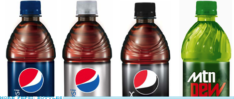
But I do dig the new looks of the packaging. The cans and bottles have a more cleaner look. At the moment they have allot of sponsor things and too much going on. And the clean looks is much refreshing but I doubt it last very long till the next special event when they at their sponsored athletes on them.
This design is done by Arnell group however their website really show almost nothing they done only just a big list of clients.
Credits to: Brandnew for the info on the rebrand
Comments